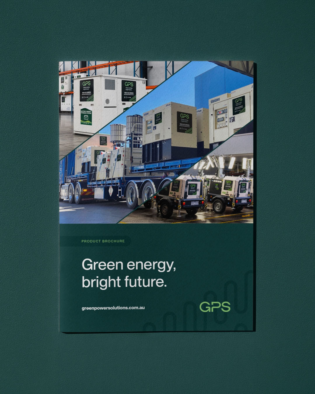
Designing a product brochure for an industrial business is about more than creating something that looks good. It needs to organise a huge amount of information, communicate the brand clearly and, most importantly, be practical for the people actually using it. For the Green Power Solutions Product Brochure, this meant bringing together generators, battery energy storage systems, lighting, fuel storage and supporting equipment into one clear, consistent and bulletproof document that still had enough personality to yell, “pick me up”.
Building the Structure
Before focusing on individual page layouts, we needed to understand how the information would work across spreads, product chapters and the brochure as a whole.
Each chapter needed a clear hierarchy between introductions, product imagery, key features and technical specifications. Establishing this upfront gave us a system that could be carried throughout the document, making a fairly complex brochure much easier to navigate.
The balancing act was maintaining that consistency without making every page feel identical. Some products required detailed comparison tables, while others needed more room for imagery, diagrams or performance data. The structure needed to be consistent enough to feel connected, but flexible enough to let the information dictate the layout.
Extending the Existing Brand
The brochure needed to feel unmistakably GPS, while extending the existing brand into a new format and application.
Rather than creating a new visual direction, we used the established colours, typography and graphic language as the foundation, then explored how those elements could work across a much larger and more information-heavy document.
The challenge was to make the brochure feel fresh, innovative and exciting for the client without creating separation from the brand they had already established. From imagery and page layouts through to tables, chapter navigation and technical information, every element needed to feel like a natural extension of GPS.
This allowed us to introduce something new while still maintaining a clear and consistent connection back to the existing brand.
Designing for the End User
Within the hire and industrial sectors, a brochure isn’t just marketing collateral. It’s a practical sales and reference tool.
Someone may need to quickly find a particular generator size, compare battery systems or check specifications such as output, dimensions, fuel consumption or operating capacity. That makes hierarchy, legibility and navigation just as important as the visual design.
Tables need to be easy to compare. Imagery needs to help identify products. Key figures need to stand out. The design needs to help someone find what they’re looking for without making them work for it.
Getting the Details Right
Accuracy becomes even more important when you’re dealing with technical information.
Before anything is designed, there is often a process of siphoning through product sheets, existing brochures, manufacturer data, website content and internal documents to find the clearest and most up-to-date source of truth.
That information then needs to be checked, structured and translated carefully into the brochure. Specifications, units, figures and product terminology all need to align, particularly when the same information is also appearing across the existing website and other collateral.
A small inconsistency in a table can quickly become a bigger issue once that information starts being reused elsewhere. Getting the details right at this stage creates a much stronger foundation for future product sheets, website updates, sales material and other communications.
The goal is to create a document that not only looks considered, but can also be relied on as an accurate reference point moving forward.
For GPS, the end result wasn’t simply a new brochure. It was a structured design system that brings brand, imagery and technical information together in a way that is clear, consistent and genuinely useful.